

YouGov conducts thousands of interviews every day, and uses the data to model the vote, state by state
It has taken a while for most observers to wrap their minds around the fact that the 2016 election is close. Most of the post-convention polling for the 2016 US presidential election has shown Hillary Clinton ahead of Donald Trump, but it is increasingly becoming clear from both national and state-level polling that this will be no blow out. Today, we are releasing polling for all 50 states and DC, which we will update daily through election day. Clinton is currently ahead of Trump in the national popular vote by nearly the same margin that Obama defeated Romney in 2012. Her electoral college lead is a bit less secure though, because of shifts in state-level support versus 2012. Clinton's lead has widened since the first debate substantially; ten days ago the race was closer.

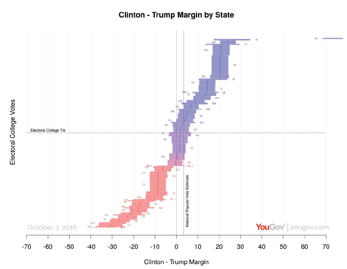
We currently estimate that Clinton's national popular lead is 3.9%, based on polling through Tuesday 4 October. When we look at the state-level estimates, we see that Trump's position in the electoral vote is stronger than in the popular vote, Clinton has leads that are narrower than her national lead in the key states. In the current tipping point state in our analysis, Florida, we estimate Clinton's current lead at 2.0%. The reason for the divergence between the popular vote and the electoral vote is that we estimate a large group of states including Wisconsin, Nevada, Iowa, Pennsylvania, North Carolina, Florida and Ohio all lean slightly towards Trump relative to the national popular vote, and so Trump may be able to narrowly win the electoral vote while narrowly losing the popular vote if he wins most of those states.
Nationally, there are more Obama 2012 voters switching to Trump than Romney 2012 voters switching to Clinton. These losses are mostly cancelled out by Clinton's very large lead among the new cohort of eligible voters who are currently 18-21, but those switchers are disproportionately in states like Pennsylvania, Ohio, Wisconsin and Iowa where Democrats have won in recent presidential elections by close to the national margin, which is why Clinton's electoral college position is not as strong as Obama's was.
We will be posting further details of the demographic breakdowns of our polling in the coming weeks, but you can see many of these already. For the details of our methodology, read on...
Our Approach
The raw data for our analysis is a rolling sample of over 30,000 respondents to YouGov’s polling over the past two weeks, updated with around 3,000 new interviews every day; however turning that into state-level estimates involves several other sources of data to ensure that we are generating a representative portrait of the electorate, not just of those who respond to our polls.
The approach we are following, which is referred to as multilevel regression and post-stratification (MRP), has three components. Here we will use a bit of shorthand that is useful for describing the approach: when we refer to a `voter type', we mean someone's measurable characteristics. This includes age, gender, education, who they voted in 2012, where they live, and so on. So one type of (potential) voter in the election might be a female, age over 85, with post-graduate education, living in the 9th Congressional district of Massachusetts, who voted for Obama in 2012. Change any of those characteristics, and you have another type. For each of these types, there are three important quantities that we would like to know.
- What proportion of people of that type will vote for Clinton, Trump, Johnson, Stein, etc, among those who do vote?
- What proportion of the individuals in each voter type will turn out to vote?
- How many (voting eligible) individuals are there of that type?
If we knew all three of these for every type, we could simply multiply the vote shares for each candidate (1) by the turnout share (2) by the number of voters of each type in the voting eligible population (3), add the results for every type together, and we would have the number of votes for each candidate overall. The difficulty is in forming high quality estimates of each of these from the available sources of data that we have to work with. Here is how we have formed our estimates.
- We estimate the proportion of people of each type who will vote for Clinton, Trump, Johnson, Stein and everyone else, among those who vote, using the roughly 50,000 YouGov panelists who have responded to surveys in the last fourteen days. We estimate how support for each candidate varies as a function of 2012 vote choice, age, education, gender, race, marital status and date of interview, as well as many interactions between these. In addition to the ways that voters vary in their intentions by their individual characteristics, we also model how they vary on average by the congressional district, state, and region (census division) that they live in.
- We estimate the proportion of people of each type who will turnout using a similar model based on individual-level and geographic-level variables, however, this model is not fit on the YouGov panel. We use the November 2012 Current Population Survey, which asked about election turnout in addition to a variety of other attributes of individuals. We use the CPS to calibrate the likely demographic profile of turnout because the CPS is a large (about 100,000 respondents) random survey of individuals in all 50 US states, it gets a relatively high response rate, and it is not primarily about politics. This means that it is likely to yield a more representative picture of voter turnout, and how it varies across different groups in the population. We have made a judgment call that we would rather use a high quality estimate of the patterns of turnout from the 2012 general election than a low quality estimate of the patterns of turnout for the 2016 election. Given the historical stability of turnout patterns we think this is a good bet, but this is a key place where we might get things wrong if there is a large change in turnout patterns. A similar strategy worked well for our analysis of the UK referendum on leaving the EU earlier this year, even though turnout was substantially higher in that referendum than in the preceding general election.
We augment this data by imputing 2008 turnout for each individual onto each observation using the information in state-level voter files about the rate at which voters and non-voters in 2008 voted again in 2012. This information is important because mostly the same people vote and do not vote in every election, and one of the critical tasks of the turnout model is to get the right mix of 2012 voters and non-voters in our 2016 estimates. The best place to estimate this is through comparing 2008 and 2012, although patterns in 2016 versus 2012 could of course be different.
- We estimate how many people there are of each type in the electorate primarily based on the 1% microdata sample from the 2010 US Census, with updated distributions of race, age, gender and educational qualifications based on the American Community Survey conducted by the Census Bureau each year. We then augment this data by imputing 2012 election turnout and vote of each of these 2.3m individuals using CPS and YouGov survey data from around the 2012 election, plus the knowledge of how many people voted for each party in each congressional district and state. The logic of this approach is that, at the very least, we know we have the right number of 2012 general election supporters of each party (and non-voters) in each congressional district and state, as well as the right mixes and combinations of age, gender, etc.
This general approach worked well in the UK referendum on leaving the European Union earlier this year, albeit with entirely different data sources. It also works well when we go back and re-evaluate YouGov's polling for the 2012 US presidential election. YouGov's polling in September of that year, analysed in the same way as we are analysing the 2016 data, with the data sources available at that time, predicted a 4.1% Obama margin, versus the 3.9% that resulted on election day. Only two states were incorrectly predicted, New Hampshire and North Carolina. YouGov's polling in October and November yielded similar estimates, the final polling in November yielded the same 4.1% predicted margin, and only erred on North Carolina.