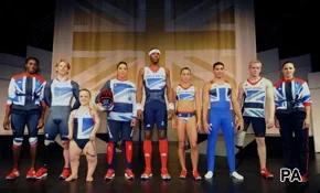
Leading British designer Stella McCartney, who was commissioned to design the costumes for Britain’s Olympic athletes, recently said she wanted Team GB athletes to feel ‘special’ in their Olympic kit.
The costumes, which were unveiled on March 22nd, have received mixed reviews, with Team GB cyclist Bradley Wiggins joking on Twitter that Ms McCartney was a bit ‘Lucy in the Sky With Diamonds’ when she designed the Olympic kit. (Her father, Sir Paul McCartney, has said that the hit Beatles song was a reference to LSD.).
Others were more enthusiastic about the design, however, with Olympic gymnast Louis Smith describing the kit as ‘comfortable, nice to wear, professional and sexy’.
For the second instalment in our SportsLab series chronicling your views on the Olympics, we invited you to tell us:
- Firstly, whether you like or dislike the costumes fashion designer Stella McCartney has created for ‘Team GB 2012'.
- And second, by inviting you to imagine yourself in the role of Team GB designer, to tell us how your design would differ from Ms McCartney’s, if at all.
The largest proportion of people taking part said you liked the Team GB costumes.
- Those who were fans of Ms McCartney’s design said it was ‘modern looking’, and an innovative twist on the Union flag.
- These participants said you liked her choice of colours, which you said made the costumes ‘distinctive’, ‘stylish’, ‘understated’ and ‘smart’ – ‘like they mean business’.
A smaller, yet still significant proportion of participants said they disliked the Team GB costumes.
- The main complaint of participants who did not care for Ms McCartney’s design was that it used too much blue and too little red, and was not representative of the nations making up the UK.
- You told us you found the costumes overly complex, and that the symbolism of the Union flag was lost in the design. Participants holding this view were after a more conventional representation of the flag, and thought McCartney took her interpretation too far in the opposite direction.
VIEWPOINT: 'I like the Team GB Olympic kit'
“The Union flag design is easily recognisable and translates well onto the different costumes required for the individual athletes, giving team GB a sense of unity. Excluding the red from the flag logo, whilst using it on the costume details, was inspired. Stylish yet funky” Mike R, N Wales
“Not too flash, not to drab, good middle ground. Good strong main colours; looks like it means business and not over the top as the rest of the games is getting” Anon
“It’s British colours, red white and blue, and features the Union flag so our athletes will be easily recognisable, and looks smart” Scott D, Leicester

“There is a lovely contemporary style and look to them – very smart and 'the biz'” Dean W, Nottingham
“Clearly British, but understated and classy when there'll be masses of Union flags on display anyway” Colin B, Dorking
“The colours stand out and they are different. You can still see the GB flag, but in a subtle, more fashionable way. It's turning and giving sport wear a different light” Anon
“They are clearly part of the same team, and they are also clearly based on the Union flag, but without slavishly following the tradition of red, white and blue. They look modern too – a lot of the old kit has ended up looking really old fashioned” Anon
“They feature our flag in a 'new' way, particularly like the one on the runner with the blue shorts and red socks – better than the hideous flame tracksuits!” Kate, Skye
VIEWPOINT: 'I dislike the Team GB Olympic kit'
“There is a distinct lack of red. The red of the red, white, and blue flag seems to have been replaced with a garish orange. The representation of the flag itself is all in blue. I'd have rather seen it in its true form with the correct colours” Katherine, Manchester
“Too fussy and complex. They don't look fast” Anon
“The kit is a mishmash of ideas and dishonours our national flag” Beverley, Staffordshire Moorlands

“The costumes do not show the national colours of the four nations that make up Team GB, especially the red of the Saint George’s Cross, and nothing for the Welsh or Northern Irish team members – utter rubbish” Harry, England
“Our national flag is not blue, black, grey and white! It's a nasty thing to do to our national emblem” Anon
“They do not look like our flag. Rather, they look to present just Scotland rather than all of the UK. I am proud of my British heritage from all over the UK, but these uniforms symbolise everything but our unity. They are confusing, unclear and quite frankly look rather silly! We have the most easy to identify flag in the world and everybody knows it so why tear it apart and remake it? It is simply awful!” Leon, Dorset
“It is a far too stylised representation of the Union flag. The biggest problem is: where is the red? The principal nation of the union is England and our cross is red” John W, Suffolk
“I feel that the designs are too far removed from our standard red, white and blue kits. At a games that we are hosting, our athletes should be easily recognisable in a 'classic' kit. The colour scheme being used here looks like something from a drab Power Point presentation” Anon
Q: Now imagine you have been put in charge of designing the Olympics kit. How would your design differ from McCartney’s?
In line with the critics' responses in SportsLab, the key theme emerging from your comments on how your design would differ from Stella McCartney’s was that there would be more red, and the Union flag would be more obvious in the design.
Some participants said they would not change a thing about the costumes, however, and praised Ms McCartney for a job well done.

What's your assessment of the Team GB costumes?
Share your views in Disqus below


