British people perceive their tax contributions to be more evenly distributed than they really are
HM Revenue and Customs began sending 24 million people their first annual tax summary this week, showing how their income tax and national insurance contributions are spent on public services. The letters include pie charts depicting the distribution of their money over 15 public spending categories, and tables explaining what this equates to in terms of their salary.
The figures show that a person on a slightly below-average salary of £23,000 pays £1113 towards welfare, £857 on health and £597 on pensions. They only pay £34 in UK contributions to the EU budget.
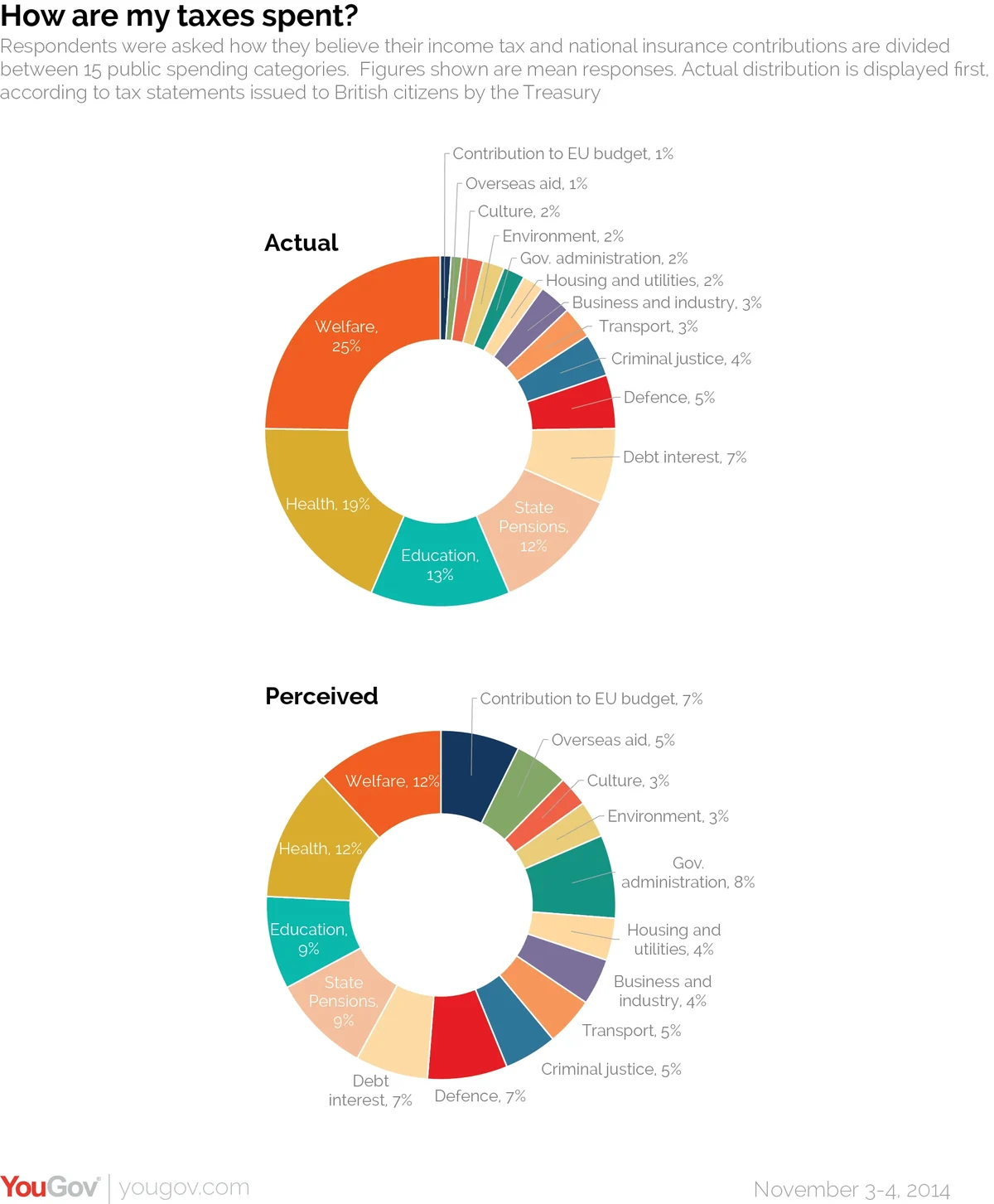
New YouGov research finds that people greatly overestimate this figure, and believe tax is distributed far more evenly than it really is. The biggest disparities include smaller-than-actual average estimations for welfare (12% instead of 25%) and health (12% instead of 19%) and larger-than-actual guesses for the EU budget (7% instead of 1%) and government administration (8% instead of 2%).
The actual and perceived percentages are as follows:

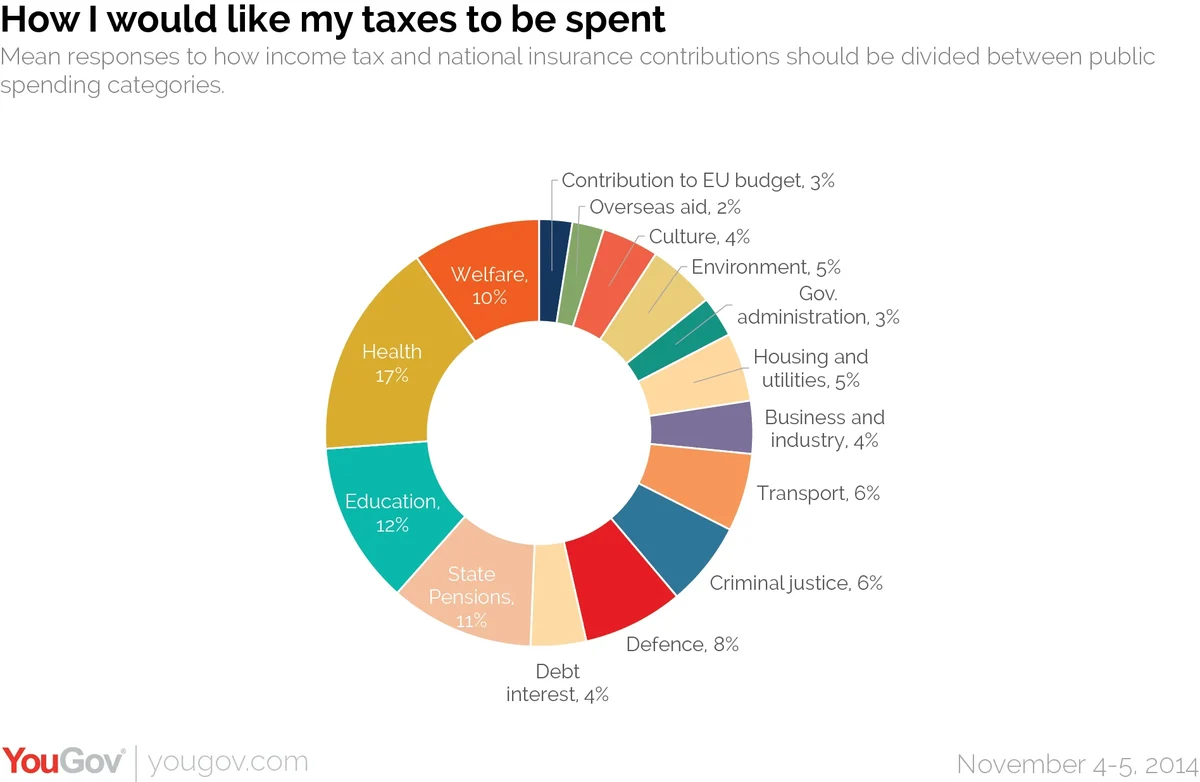
In addition, we asked respondents to divide up the tax take how they would like it to be spent. Here, the pie chart changes once again, with increased amounts going on health and education and reduced amounts going on the EU budget and government administration, relative to perceptions.

There was recently a controversy over the way the government divided up its spending on this report, with "welfare" including a broad array of categories. YouGov research revealed that the way the welfare budget was described made a big difference to overall opinion on welfare spending.


