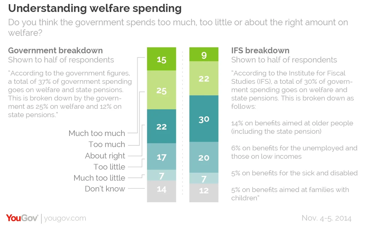
A YouGov polling experiment confirms that voters take very different views on welfare spending depending on how it is broken down
The government is now issuing personal tax statements which show how your tax is spent, with 'welfare' accounting for 25%. But critics at the Institute of Fiscal Studies say it's a misleading figure, as many of the constituent parts of that figure are not the kind of 'welfare' that people are often hostile to. The intention, some critics argue, is to manipulate people into supporting the government's plans to further cut welfare.
For the first time, the government is using its direct communication with the citizens to communicate information that helps people understand how their taxes work. It is a milestone. Ensuring that this communication is shaped to improve understanding, rather than to communicate a government point of view, is of great long-term importance.
This is a great example of how polling can shed genuine light, as we can objectively test the different effect of the two arguments in practice. The test does not, of course, say anything about who is right or wrong in arguments about welfare, but it can be relied upon to tell us what the different effects of wording will be on the reader.
YouGov randomly split a sample of 2047 British adults into two: Sample A was given the government's aggregated number – see the wording below – and Sample B was given the breakdown that the IFS says is more fair and informative, also shown below. The result was clear: the government's version gets net 16% saying welfarespending is "too much". The IFS version leads to only net 4% saying "too much".

PA image


