The National Gallery's Senior Curator gets involved with Labs as we ask art-lovers to help with an experimental comparison project
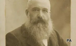
A few weeks ago, we invited YouGov panellists to get involved in an exciting, collaborative project – a partnership between YouGov and David Jaffe, Senior Curator at the prestigious National Gallery in London (pictured, above right).
Jaffe hand-picked a number of art works from the Gallery's exhaustive collection of more than 2,300 pieces, and paired them up, with a view to finding out what the art-lovers among our panel thought about them.
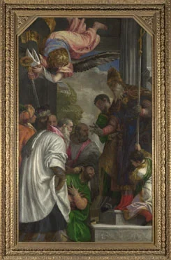
- Paolo Veronese, "The Consecration of St Nicholas" (1562)
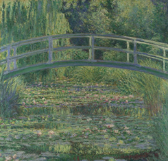
- Claude Monet, "The Water Lily Pond" (1899).
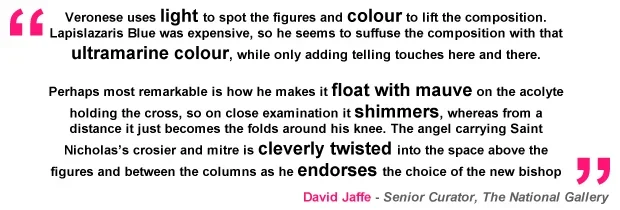
For each painting he picked, Jaffe wrote a commentary, giving his insights into the paintings – mimicking the experience of reading the annotations attached to art works as you physically move around a gallery.

To launch the experiment, we composed a survey to enable those who took part* to compare the paintings.
Want to get involved in experimental projects and collaborations, fitting your interests?
Sign up to the YouGov panel today and be part of something different.
Through this visually-stimulating survey, we hoped to discover:
- Firstly, how much our participants liked Veronese and Monet’s works separately
- Secondly, how helpful they found the information David Jaffe had given about each of the paintings (and to share any thoughts they had on the artworks)
- And finally, after much in-depth consideration, to select their preferred painting of the two – revealed at the end of this report!
*540 self-professed art-lovers took part in this YouGov/David Jaffe collaboration.
Painting-by-painting: Results and participants’ feedback

1. THE CONSECRATION OF ST NICHOLAS (1562), Paolo Veronese
*As well as viewing the paintings in the confines of the survey, participants were instructed to click through to the National Gallery website to look at the artworks in greater detail.
Q: How much do you like the painting?
- Overall participants liked the artwork, giving it 6/10
- This became 7/10 for panellists aged 60+
- And 5/10 for our younger participants, in the 18-24 and 25-39 age group

Q: How helpful do you find the information given here?
- 81% of all those who took part said they found this information helpful (52% 'fairly' and 29% 'very' helpful )
- Just 17% found the information not helpful
- All-in-all, older participants tended to find the information more helpful than the younger participants, with 87% of the 60+ group, and 84% of the 40-59 age group saying they found the blurb helpful, compared with 68% of the 18-24 year olds
Open Q: What do you think about Veronese’s The Consecration of St Nicholas?
We then invited participants to comment on the painting.
These were the most common themes that arose from their feedback, accompanied with representative comments. Click on the headings to read each section:
A powerful, religious art work
Many participants commented on the painting’s religiosity.Several participants were taken by Veronese’s powerful depiction of the act of consecration; the religious symbolism. Some remarked that they didn’t particularly like, or were turned off by, religious paintings in principle, where others’ interest in the story was stirred. A few participants said they would have liked more information on the religious context of the work to understand it better.
“It is exceptionally executed but religious depictions leave me cold”
“Striking religious image. Nice detail and use of light”
“I struggle with religious paintings where the subject is a relatively unknown quantity”
“Powerful piece and shows great reverence to the subject material”
Use of colour
Participants were regularly enthusiastic about
this painting's use of colour, focusing on the details the accompanying commentary on Veronese had brought to their attention, and remarking on the depth, vibrancy, and quality of the colour in the painting.
“Not a huge fan of Veronese, but I find his use of colour expressive and extravagant, infusing the work with power and light. A master of his time, his work is vibrant and a real classic specimen of the art of its time”
“Very nice, great detail, love the vibrancy of the colours”
“The painting is very typical of the period. I especially like the vibrant blues and greens used to draw your eye to the important figures”
“Beautiful use of the blue and also the white robes which seem to shimmer”
"I appreciate the painter's skill"
Many participants remarked how they appreciated Veronese's skill as a painter - a compliment both from those who weren’t especially taken with the work, or were critical of other aspects of it (e.g. the composition) but thought Veronese’s talents impressive, and those who felt his work exquisite through-and-through.
“This is an excellent graphic painting and one which would attract attention. It tells the story so beautifully and there can be no mistake as to what is going on”
“Amazing painting. Do I like it? Probably not. Do I appreciate it? Yes”
“This is not the sort of subject I like but it is very skilfully painted”
“The way that Veronese has captured the fall and folds of the clothes as well as the intricate design on the bishop’s cloak is impressive”
The composition of The Consecration
The composition of The Consecration – the thoughts shared by participants were largely more positive than negative regarding Veronese’s arrangement. Participants complimented Veronese on a well-composed work that was often ‘dramatic’, detailed, and which made clever use of space. Contrasting, negative comments tended to describe the painting as ‘busy’ or confusing.
“It is an amazing painting considering it is very small and all the people are in this space. It does not seem over crowded”
“This is a well-rounded, well-balanced composition where the spectator's look is driven directly to the centrepiece that is St Nicholas. It shows talent and control. Beautifully done”
“The colours are vibrant. I feel the picture is slightly crowded with people and at first it is difficult to translate what is happening”
Liked, loved, or left cold by the painting?
- Those who said they loved, liked, or were moved by the painting cited several reasons for this.They found it compelling; enjoyed the way Veronese ‘told a story’; liked its conventionality; felt the painting had real atmosphere; or simply felt it had been beautifully executed.
“I love it, it is so moving and beautiful. I can't explain why I have never seen this painting before but it brought a lump to my throat. It is truly an amazing painting”
“A beautiful piece that stirs the mind”
“Interesting and intriguing. Lots of detail. Lots to consider”
- But participants unconvinced by The Consecration said the style of the painting didn’t resonate with them, or interest them, or that the style of painting didn’t appeal:
“Technically very good, but somehow uninvolving. I don't find myself inspired by it. It is something I would dutifully look at in a gallery but not love”
“It’s not the kind of painting I enjoy looking at. I find it boring and dull”
“I don't really know what is going on in the painting. I don't like it. The people in don't interest me”
Light and shade
A few participants making comments on
the recreation of light in the paintingsaid they liked Veronese’s treatment of it, and found the balance of it with shade interesting. But this was juxtaposed with a number of remarks from others who found the work too dark for their tastes, while others felt Veronese’s darker tones, and use of shade, contributed to the mood of the piece.
“Interesting use of light and shade to pick out certain people. The people are clustered very closely together”
“I like the way that the background is very dark and the figures are almost in silhouette. This brings your eye to the foreground figures and creates an air of mystery in the background”
“It is a rather darker painting than I usually like and I feel that a certain degree of it somewhat lost in the areas of shadow”
2. THE WATER LILY POND (1899), Claude Monet
 *As before, participants were instructed to click through to the National Gallery website to look at the artwork in greater detail.
Q: How much do you like the painting?
- Participants gave the Monet an 8/10, edging closer to ‘I love it’ on the scale of feeling
- This dropped by one point to 7/10 for the 18-24 and 25-39 year-olds who took part

Q: How helpful do you find the information given here?
- 74% of all participants found this information along the theme of “light and colour” helpful (50% “fairly” helpful)
- 24% found the information not helpful – perhaps reflecting the shorter length of the commentary
- Once again, older participants found the accompanying blurb on the painting slightly more helpful than their younger counterparts. 81% of participants aged 60+; 79% of the 40-59 year-olds; and 71% of the 25-39 year-olds found the information helpful, against 63% of 18-24 year-olds.
Open Q: What do you think about Monet’s The Water Lily Pond?
Once again, we invited participants to comment on the painting. Here are the most common themes that came out of their feedback, accompanied with representative comments. Click on the headings to read each section:
'Moved' by Monet
'Moved' by Monet–Almost half of all those who took part in the survey said they were 'moved' or affected by Monet’s work in some way. Many spoke of the calming effect of the painting; and described the peaceful sensation that washed over them as they looked at the pond setting, which as such rendered
The Water Lily Ponda scene several participants expressed a desire to escape to.
“I think it is serene, peaceful, accomplished and beautiful”
“Captivating work – you are drawn in”
“Like the calm stillness, you feel you can hear the birds singing”
A famous and 'familiar' painting
Coinciding with this, several participants spoke of the
fame and familiarity of the work –citing this as the reason for their own love of it; or stating simply that they were more familiar with the Monet than with the Veronese; or, conversely, that they disliked the piece, or were unable to give it due objectivity, because it was so well-known.
“It's a very attractive picture, familiar to most”
“I am a fan of impressionism and this is a classic. It’s not my favourite Monet, but it has earned its fame.”
“It's too familiar really, been reproduced too many times, it has lost its impact”
Use of colour
Use of colour – Similarly, the majority of the comments from participants talking primarily about the colours used in Monet’s work complimented the artist, ranging from highly enthusiastic comments on the specific use of mauves, to how colour contributes to the overall impact of the work on the observer, to those who said simply that they thought the colours used attractive or well-applied.
“Wonderful – what can be created using a variety of shades, blues, greens, and then adding a splash of subtle contrasting colour
“Amazing use of colours and expression, beautiful and quite mood-inspiring”
“The colours are pretty. It's quite inoffensive, but I can't find much sense of purpose in it. It would make interesting wallpaper”
Treatment of light
Treatment of light – A smattering of participants referring to Monet’s evocation of light in The Water Lily Pond honed in on the artist’s capture of reflections in the water, and the way that light brings the canvas to life.
“The way Monet treats light gives the painting a very dream-like feeling. What is particularly interesting is the detail in the reflection of the trees in the water”
“I have always loved this painting – so easy to slip away in one's mind and be inside the painting; imagining Debussy's Arabesque or Claire de Lune on the willow branches ... love how the light seems to move and dance, the painting seems alive”
The composition of The Water Lily Pond
Composition –individuals complimenting the
artist’s arrangementspoke varyingly of the effective simplicity of the subject, and the captivating detail that keep them occupied “for hours”. The (very) few participants who weren’t so keen on the composition gave very different reasons for disliking it.
“Really like it, the more you look the more you see, very three dimensional”
“It's a very busy, cluttered painting, using the same limited colours. The brush strokes are very small and careful”
"I appreciate the painter's skill"
Appreciate Monet’s skill –as with participants’ feedback for the Veronese, responses in this vein ranged from reverence for the sheer stature of Monet’s talents, to those who appreciated this, but were else unmoved by
The Water Lily Pond.
“Monet has the ability to create a marvellous work of art from an everyday scene. This is just one of the views from a lovely garden in Giverny, France. The lilies, bushes and water blend so easily that the audience can almost feel the tranquillity”
“I prefer it to the previous painting, but again, not really my cup of tea, although I can appreciate the artistry”
Q: Which of the two paintings do you prefer?

- 70% of the art-lovers who took part picked The Water Lily Pond, by Claude Monet, as their favourite painting of the two
- 18% preferred Veronese’s The Consecration of St Nicholas
- 10% 'didn’t have a preference'
Why did participants prefer The Water Lily Pond to The Consecration of St Nicholas?
- The Water Lily Pond is more enjoyable – the prevailing view from the art-conscious panellists who preferred Monet’s work. The setting, style, and colours of the painting evoked a peaceful atmosphere that you could get lost in – and return to, again and again.
- The Water Lily Pond subject matter – Equally, these participants said they preferred the simpler, natural setting, capturing a real spot, to the religious, ‘fantasy’ iconography of Veronese’s masterpiece.
- The Water Lily Pond is more appealing and by a revolutionary painter – Many participants remarked that, to make a direct comparison, the aesthetic of The Water Lily Pond was more appealing, and came from the brush of a painter whose style revolutionised art.
What other information would participants have liked accompanying the paintings?

While many participants were satisfied with the information that had been provided for each painting, the vast majority were hungry for more colour and context, especially:
- Who were the artists? – a short biography of each; information on his painting techniques and how they evolved; who their contemporaries were; when and where in the world each artist painted; what were their influences; what was their outlook? (1899 photograph showing Monet, by Paul Nadar, right)
- Historical context – For Veronese’s work, detail on the religious painting tradition; why certain colours were considered so important. For Monet, they wanted more context on impressionism, and the artist’s contribution to that movement. And what was the impact of these paintings socio-culturally?
- Information on the paintings’ stories – Why did Veronese and Monet make St Nicholas and a lily pond their subjects? Who were St. Nicholas, and the other featured figures? In The Water Lily Pond, where in the world was the real pond, and what was it called? And why were these paintings created, and for whom – friend or patron?
Did our art-lovers enjoy taking part in this survey?
On the whole, participants said that taking part in this collaborative survey was that it was wholly enjoyable, refreshing and engaging – and something they would like to repeat…
“That was most enjoyable – hope I get to do more. Will the National Gallery be looking at the comments with a view to how they curate a show?”
“Really made me think. Much appreciated”
“Nice to contribute to something really different”


